# 3.2:公共事件类属性
上节笔者介绍了ArkUI开发框架组件的公共样式属性,本节笔者简单介绍一下组件的公共事件属性,读者也可自行查看 CommonMethod 的源码了解其它事件属性。
# 3.2.1:点击事件
export declare class CommonMethod<T> {
  onClick(event: (event?: ClickEvent) => void): T;
}
2
3
- onClick:给组件添加点击事件的回调,设置该回调后,当点击组件时会触发该回调。回调参数
event包含了点击信息,比如点击坐标等。
简单样例如下所示:
Text('Click AAA')
  .width(120)
  .height(40)
  .backgroundColor(Color.Pink)      // 设置背景颜色
  .onClick(() => {                  // 设置点击事件回调
    console.log("text clicked AAA") // 日志输出
  })
2
3
4
5
6
7
点击 Text 组件,控制台会打印 text clicked AAA 的日志。
# 3.2.2:触摸事件
export declare class CommonMethod<T> {
  onTouch(event: (event?: TouchEvent) => void): T;
}
2
3
- onTouch:给组件设置触摸事件的回调,设置该回调后,当触摸组件时会触发该回调。回调参数
event包含了事件类型、点击坐标等信息。
简单样例如下所示:
Text('Click AAA')
  .width(120)
  .height(40)
  .backgroundColor(Color.Pink)
  .onTouch((event) => {                          // 设置触摸事件回调
    if(event.type == TouchType.Down) {           // 手指按下的事件回调
      console.log("touch down")
    } else if(event.type == TouchType.Move) {    // 手指移动的事件回调
      console.log("touch move")
    } else if(event.type == TouchType.Cancel) {  // 触摸事件取消时的事件回调
      console.log("touch cancel")
    } else if(event.type == TouchType.Up) {      // 手指抬起的事件回调
      console.log("touch up")
    }
  })
2
3
4
5
6
7
8
9
10
11
12
13
14
15
触摸该 Text 组件,控制台会打印如下日志。
[phone][Console   DEBUG]  03/15 00:05:47 88489984 app Log: touch down
[phone][Console   DEBUG]  03/15 00:05:47 88489984 app Log: touch move
[phone][Console   DEBUG]  03/15 00:05:47 88489984 app Log: touch move
[phone][Console   DEBUG]  03/15 00:05:48 88489984 app Log: touch move
[phone][Console   DEBUG]  03/15 00:05:48 88489984 app Log: touch up
2
3
4
5
笔者使用触摸事件实现的通用下拉刷新和上拉加载更多的 RefreshLayout 组件,部分代码如下所示:
Column() {
  this.headLayout()

  Column() {
    this.childLayout()
  }
  .width(this.layoutWidth)
  .height(this.layoutHeight)
  .backgroundColor(Color.Pink)
  .position({
    x: 0,
    y: this.offsetY + this.headHeight
  })

  this.footLayout()
}
.width(this.layoutWidth)
.height(this.layoutHeight)
.backgroundColor("#aabbcc")
.touchable(this.touchable)
.onTouch((event) => {          // 添加触摸事件的回调
  switch (event.type) {
    case TouchType.Down:
      this.onTouchDown(event); // 手指按下的事件处理
      break;
    case TouchType.Move:
      this.onTouchMove(event); // 手指移动的事件处理
      break;
    case TouchType.Up:         // 手指抬起的事件处理
    case TouchType.Cancel:
      this.onTouchUp(event);
      break;
  }
})
2
3
4
5
6
7
8
9
10
11
12
13
14
15
16
17
18
19
20
21
22
23
24
25
26
27
28
29
30
31
32
33
34
样例运行结果如下图所示:
# 3.2.3:拖拽事件
export declare class CommonMethod<T> {
  onDragStart(event: (event?: DragEvent, extraParams?: string) => CustomBuilder | DragItemInfo): T;
  onDragEnter(event: (event?: DragEvent, extraParams?: string) => void): T;
  onDragMove(event: (event?: DragEvent, extraParams?: string) => void): T;
  onDragLeave(event: (event?: DragEvent, extraParams?: string) => void): T;
  onDrop(event: (event?: DragEvent, extraParams?: string) => void): T;
}
2
3
4
5
6
7
给组件设置拖拽事件的回调,设置该回调后,当拖拽组件动作发生时会触发相应的拖拽回调,各拖拽方法说明如下:
onDragStart:第一次拖拽此事件绑定的组件时,触发回调。参数
event包含了拖拽坐标等信息,extraParams拖拽事件的额外信息。📢拖拽事件注意事项:
长按150毫秒(ms)可触发拖拽事件。
优先级:长按手势配置时间小于等于150毫秒时,长按手势优先触发,否则拖拽事件优先触发。
onDragEnter:拖拽进入组件范围内时,触发回调。参数
event包含了拖拽坐标等信息,extraParams拖拽事件的额外信息。📢拖拽事件注意事项:
- 当监听了
onDrop事件时,此事件才有效。
- 当监听了
onDragMove:拖拽在组件范围内移动时,触发回调。参数
event包含了拖拽坐标等信息,extraParams拖拽事件的额外信息。📢拖拽事件注意事项:
- 当监听了
onDrop事件时,此事件才有效。
- 当监听了
onDragLeave:拖拽离开组件范围内时,触发回调。参数
event包含了拖拽坐标等信息,extraParams拖拽事件的额外信息。📢拖拽事件注意事项:
- 当监听了
onDrop事件时,此事件才有效。
- 当监听了
onDrop:绑定此事件的组件可作为拖拽释放目标,当在本组件范围内停止拖拽行为时,触发回调。参数
event包含了拖拽坐标等信息,extraParams拖拽事件的额外信息。
简单样例如下所示:
@Entry @Component struct Index {
@State numbers: string[] = ['one', 'two', 'three', 'four', 'five', 'six']
@State text: string = ''
@State bool: boolean = false
@State bool1: boolean = false
@State size: string = ''
@State appleVisible: Visibility = Visibility.Visible
@State orangeVisible: Visibility = Visibility.Visible
@State bananaVisible: Visibility = Visibility.Visible
@State select: number = 0
@State currentIndex: number = 0
@Builder pixelMapBuilder() {
Column() {
Text(this.text)
.width('50%').height(60).fontSize(16).borderRadius(10)
.textAlign(TextAlign.Center).backgroundColor(Color.Yellow)
}
}
build() {
Column() {
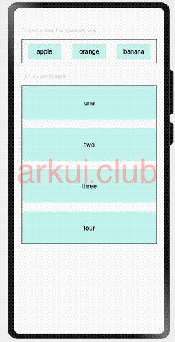
Text('There are three Text elements here')
.fontSize(12).fontColor(0xCCCCCC).width('90%')
.textAlign(TextAlign.Start).margin(5)
Flex({ direction: FlexDirection.Row, alignItems: ItemAlign.Center, justifyContent: FlexAlign.SpaceAround }) {
Text('apple').width('25%').height(35).fontSize(16)
.textAlign(TextAlign.Center).backgroundColor(0xAFEEEE)
.visibility(this.appleVisible)
.onDragStart(() => {
this.bool = true
this.text = 'apple'
this.appleVisible = Visibility.Hidden
return this.pixelMapBuilder
})
Text('orange').width('25%').height(35).fontSize(16)
.textAlign(TextAlign.Center).backgroundColor(0xAFEEEE)
.visibility(this.orangeVisible)
.onDragStart(() => {
this.bool = true
this.text = 'orange'
this.orangeVisible = Visibility.Hidden
return this.pixelMapBuilder
})
Text('banana').width('25%').height(35).fontSize(16)
.textAlign(TextAlign.Center).backgroundColor(0xAFEEEE)
.visibility(this.bananaVisible)
.onDragStart((event: DragEvent, extraParams: string) => {
console.log('Text onDragStarts, ' + extraParams)
this.bool = true
this.text = 'banana'
this.bananaVisible = Visibility.Hidden
return this.pixelMapBuilder
})
}.border({ width: 1 }).width('90%').padding({ top: 10, bottom: 10 }).margin(10)
Text('This is a List element').fontSize(12)
.fontColor(0xCCCCCC).width('90%')
.textAlign(TextAlign.Start).margin(15)
List({ space: 20, initialIndex: 0 }) {
ForEach(this.numbers, (item) => {
ListItem() {
Text('' + item)
.width('100%').height(80).fontSize(16).borderRadius(10)
.textAlign(TextAlign.Center).backgroundColor(0xAFEEEE)
}
.onDragStart((event: DragEvent, extraParams: string) => {
console.log('ListItem onDragStarts, ' + extraParams)
var jsonString = JSON.parse(extraParams)
this.bool1 = true
this.text = this.numbers[jsonString.selectedIndex]
this.select = jsonString.selectedIndex
return this.pixelMapBuilder
})
}, item => item)
}
.editMode(true)
.height('50%').width('90%').border({ width: 1 })
.divider({ strokeWidth: 2, color: 0xFFFFFF, startMargin: 20, endMargin: 20 })
.onDragEnter((event: DragEvent, extraParams: string) => {
console.log('List onDragEnter, ' + extraParams)
})
.onDragMove((event: DragEvent, extraParams: string) => {
console.log('List onDragMove, ' + extraParams)
})
.onDragLeave((event: DragEvent, extraParams: string) => {
console.log('List onDragLeave, ' + extraParams)
})
.onDrop((event: DragEvent, extraParams: string) => {
var jsonString = JSON.parse(extraParams)
if (this.bool) {
this.numbers.splice(jsonString.insertIndex, 0, this.text)
this.bool = false
} else if (this.bool1) {
this.numbers.splice(jsonString.selectedIndex, 1)
this.numbers.splice(jsonString.insertIndex, 0, this.text)
this.bool = false
this.bool1 = false
}
})
}.width('100%').height('100%').padding({ top: 20 }).margin({ top: 20 })
}
}
2
3
4
5
6
7
8
9
10
11
12
13
14
15
16
17
18
19
20
21
22
23
24
25
26
27
28
29
30
31
32
33
34
35
36
37
38
39
40
41
42
43
44
45
46
47
48
49
50
51
52
53
54
55
56
57
58
59
60
61
62
63
64
65
66
67
68
69
70
71
72
73
74
75
76
77
78
79
80
81
82
83
84
85
86
87
88
89
90
91
92
93
94
95
96
97
98
99
100
101
102
103
104
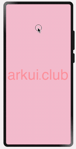
样例运行结果如下图所示:
# 3.2.4:挂载卸载事件
export declare class CommonMethod<T> {
  onAppear(event: () => void): T;
  onDisAppear(event: () => void): T;
}
2
3
4
给组件设置挂载和卸载事件的回调,设置该回调后,当组件从组件树上挂载或者是卸载时会触发该回调。各 API 方法说明如下:
- onAppear:组件从组件树上挂载的回调。
- onDisAppear:组件从组件树上卸载的回到。
简单样例如下所示:
@Entry @Component struct Index {

  @State textShow: boolean = false; // 默认状态

  build() {
    Column() {
      Column() {
        if (this.textShow) {
          Text('挂载/卸载')
            .fontSize(22)
            .onAppear(() => {
              console.log("哈哈,我被挂载了")
            })
            .onDisAppear(() => {
              console.log("呜呜,我被卸载了")
            })
        }
      }
      .width('100%')
      .height(60)

      Button(this.textShow ? "卸载" : "挂载")
        .stateStyles({
          pressed: {
            .backgroundColor(Color.Pink) // 设置点击时的样式
          }
        })
        .onClick(() => { // 依次挂载卸载Text组件
          this.textShow = !this.textShow;
        })
    }
    .width('100%')
    .height('100%')
  }
}
2
3
4
5
6
7
8
9
10
11
12
13
14
15
16
17
18
19
20
21
22
23
24
25
26
27
28
29
30
31
32
33
34
35
样例运行结果如下图所示:

日志打印如下:
[phone][Console   DEBUG]  04/01 20:04:33 135208960 app Log: 哈哈,我被挂载了
[phone][Console   DEBUG]  04/01 20:04:35 135208960 app Log: 呜呜,我被卸载了
[phone][Console   DEBUG]  04/01 20:04:37 135208960 app Log: 哈哈,我被挂载了
[phone][Console   DEBUG]  04/01 20:04:39 135208960 app Log: 呜呜,我被卸载了
2
3
4
# 3.2.5:区域变化事件
declare class CommonMethod<T> {
  // 区域变化的事件回调
  onAreaChange(event: (oldArea: Area, newArea: Area) => void): T;
}

declare interface Area {
  width: Length;            // 组件的宽度,单位为vp。
  height: Length;           // 组件的高度,单位为vp。
  position: Position;       // 组件左上角相对父组件左上角的位置。
  globalPosition: Position; // 组件左上角相对页面左上角的位置。
}
2
3
4
5
6
7
8
9
10
11
组件区域发生变化会触发该回调,比如组件尺寸或者在屏幕上的位置发生改变都会触发该回调。
- oldArea:组件变化前区域信息。
- newArea:组件变化后区域信息。
简单样例如下所示:
@Styles function btnGlobalPressedStyle() { // 定义一个全局样式
.backgroundColor(Color.Pink)
.width(180)
.height(50)
}
@Styles function btnGlobalNormalStyle() { // 定义一个全局样式
.backgroundColor(Color.Blue)
.width(180)
.height(50)
}
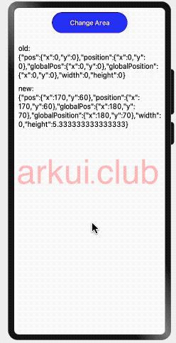
@Entry @Component struct Index {
@State text: string = "";
@State area: string = "";
build() {
Column({space: 10}) {
Button("Change Area")
.stateStyles({
normal: btnGlobalNormalStyle,
pressed: btnGlobalPressedStyle
})
.onClick(() => {
this.text += "change ";
})
Text(this.text)
.fontSize(18)
.onAreaChange((oldArea, newArea) => {
this.area = "old:\n" + JSON.stringify(oldArea) + "\n\n\nnew:\n" + JSON.stringify(newArea);
})
Text(this.area)
.fontSize(18)
}
.width('100%')
.height('100%')
.padding(10)
}
}
2
3
4
5
6
7
8
9
10
11
12
13
14
15
16
17
18
19
20
21
22
23
24
25
26
27
28
29
30
31
32
33
34
35
36
37
38
39
40
41
42
43
样例运行结果如下所示:
# 3.2.6:焦点事件
declare class CommonMethod<T> {
  // 获取焦点的事件回调
  onFocus(event: () => void): T;
  // 失去焦点的事件回调
  onBlur(event: () => void): T;
}
2
3
4
5
6
组件获取到焦点或者失去焦点时的事件回调,组件可使用焦点事件来更改内容。各方法说明如下:
onFocus:组件获取到焦点时的事件回调。
onBlur:组件失去焦点时的事件回调。
简单样例如下所示:
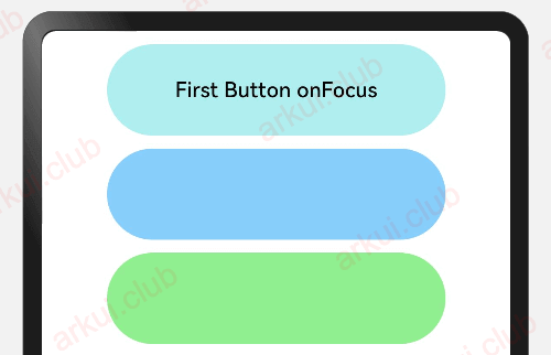
@Entry @Component struct ComponentTest {

  @State textOne: string = ''
  @State textTwo: string = ''
  @State textThree: string = ''
  @State oneButtonColor: string = '#FF0000'
  @State twoButtonColor: string = '#87CEFA'
  @State threeButtonColor: string = '#90EE90'

  build() {
    Column({ space: 10 }) {
      Button(this.textOne)
        .backgroundColor(this.oneButtonColor)
        .width(260)
        .height(70)
        .fontColor(Color.Black)
        .focusable(true)
        .onFocus(() => {
          this.textOne = 'First Button onFocus'
          this.oneButtonColor = '#AFEEEE'
        })
        .onBlur(() => {
          this.textOne = 'First Button onBlur'
          this.oneButtonColor = '#FFC0CB'
        })
      Button(this.textTwo)
        .backgroundColor(this.twoButtonColor)
        .width(260)
        .height(70)
        .fontColor(Color.Black)
        .focusable(true)
      Button(this.textThree)
        .backgroundColor(this.threeButtonColor)
        .width(260)
        .height(70)
        .fontColor(Color.Black)
        .focusable(true)
        .onFocus(() => {
          this.textThree = 'Third Button onFocus'
          this.threeButtonColor = '#AFEEEE'
        })
        .onBlur(() => {
          this.textThree = 'Third Button onBlur'
          this.threeButtonColor = '#FFC0CB'
        })
    }
    .width('100%')
    .height('100%')
    .padding(10)
  }
}
2
3
4
5
6
7
8
9
10
11
12
13
14
15
16
17
18
19
20
21
22
23
24
25
26
27
28
29
30
31
32
33
34
35
36
37
38
39
40
41
42
43
44
45
46
47
48
49
50
51
样例运行结果如下图所示:
📢:目前支持焦点事件的组件:Button、 Text、Image、 List、 Grid。
# 3.2.7:小结
本节简单介绍了组件的事件属性,事件属性在 APP 开发中不可或缺的,比如点击按钮跳转页面等,读者先简单了解事件属性的设置和用法即可,可后续对ArkUI框架的组件熟悉后可再回头观看本节内容。