# 3.4:提示设置
ArkUI开发框架提供了全局方法 bindMenu 和 bindPopup ,方便开发者合理利用弹窗选项给用户友好交互操作的体验,本节笔者介绍一下它们的简单使用。
# 3.4.1:bindMenu
bindMenu 表示给当前组件绑定一个菜单项,用户点击组件后弹出菜单, bindMenu 定义如下:
declare class CommonMethod<T> {
  bindMenu(content: { value: string; action: () => void }[] | CustomBuilder): T;
}
2
3
content 参数支持单项文本和自定义两种方式,这两种实现分别如下:
单项文本实现
当
content类型为{ value: string; action: () => void }时,value表示要显示的菜单文本,action表示点击该文本的事件回调,简单样例如下所示:import prompt from '@ohos.prompt'; @Entry @Component struct Index { build() { Column({space: 10}) { Button("bindMenu") .width(120) .height(50) .onClick(() => { prompt.showToast({message: "bindMenu"}) }) .bindMenu([ { value: "菜单1", action: () => { prompt.showToast({message: "菜单1"}) } }, { value: "菜单2", action: () => { prompt.showToast({message: "菜单2"}) } }, { value: "菜单3", action: () => { prompt.showToast({message: "菜单3"}) } } ]) } .padding(10) .size({ width: "100%", height: '100%' }) } }1
2
3
4
5
6
7
8
9
10
11
12
13
14
15
16
17
18
19
20
21
22
23
24
25
26
27
28
29
30
31
32
33
34
35样例运行结果如下图所示:
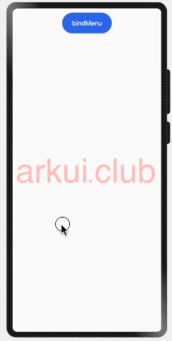
从运行结果看,使用单项文本实现一个菜单,文字太小并且样式和布局均无法修改,这种方式UI局限性太大,为了满足多样式场景需求,ArkUI开发框架提供了
CustomBuilder方式允许开发者自定义 UI 描述。CustomBuilder方式实现
CustomBuilder在common.d.ts文件中定义,源码定义如下:declare type CustomBuilder = (() => any) | void;1CustomBuilder即可代表一个空类型也可以表示一个返回任意类型的函数,自定义 UI 描述使用@Builder装饰器装饰一个方法,该方法功能和语法规范和build函数相同,返回一个 UI 布局,格式如下所示:@Builder function_name() { // @Builder修复一个方法 // UI布局 Column() { } }1
2
3
4
5用户自定义 UI 实现,就是使用
@Builder修饰一个方法,该方法返回一个 UI 布局即可,简单样例如下所示:import prompt from '@ohos.prompt'; @Entry @Component struct Index { @Builder MenuBuilder() { // 使用@Builder修饰符创建一个自定义布局 Column() { Text("菜单1") .width("100%") .height(40) .fontSize(20) .textAlign(TextAlign.Center) .onClick(() => { prompt.showToast({message: "菜单1"}); }) Divider() .width("100%") .height(1) .backgroundColor("#aabbcc") Text("菜单2") .width("100%") .height(40) .fontSize(20) .textAlign(TextAlign.Center) .onClick(() => { prompt.showToast({message: "菜单2"}); }) Divider() .width("100%") .height(1) .backgroundColor("#aabbcc") Text("菜单3") .width("100%") .height(40) .fontSize(20) .textAlign(TextAlign.Center) .onClick(() => { prompt.showToast({message: "菜单3"}); }) } .backgroundColor(Color.Pink) .width(100) } build() { Column({space: 10}) { Button("bindMenu") .width(120) .height(50) .onClick(() => { prompt.showToast({message: "test"}); // 同时设置onClick和bindMenu,onClick不生效 }) .bindMenu(this.MenuBuilder()) // 绑定自定义布局 } .padding(10) .size({ width: "100%", height: '100%' }) } }1
2
3
4
5
6
7
8
9
10
11
12
13
14
15
16
17
18
19
20
21
22
23
24
25
26
27
28
29
30
31
32
33
34
35
36
37
38
39
40
41
42
43
44
45
46
47
48
49
50
51
52
53
54
55
56
57样例运行结果如下图所示:
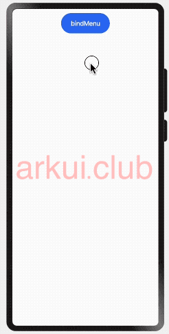
由样例可知,
Button同时设置了onClick和bindMenu方法,onClick方法不起作用,对于这种场景,可以使用bindContextMenu方法代替。
# 3.4.2:bindContextMenu
bindMenu 比 onClick 优先级高,当同时设置这俩方法时, onClick 方法是不生效的,为了解决这种冲突问题,ArkUI开发框架提供了 bindContextMenu 方法,该方法只有在长按或者右键点击组件是才会触发显示菜单项,这样就完美解决了和点击事件冲突的问题。 bindContextMenu 定义如下:
declare class CommonMethod<T> {
  bindContextMenu(content: CustomBuilder, responseType: ResponseType): T;
}
2
3
- content:参数只支持使用
CustomBuilder自定义 UI 一种方式, - responseType:触发弹窗的响应类型,
ResponseType定义了一下两种类型:- LongPress:通过长按触发菜单弹出。
- RightClick:通过鼠标右键触发菜单弹出。(为 PC 准备的(#^.^#))
简单样例如下所示:
import prompt from '@ohos.prompt';
@Entry @Component struct Index {
@Builder MenuBuilder() { // 自定义布局
Column() {
Text("菜单1")
.width("100%")
.height(40)
.fontSize(20)
.textAlign(TextAlign.Center)
.onClick(() => {
prompt.showToast({message: "菜单1"});
})
Divider()
.width("100%")
.height(1)
.backgroundColor("#aabbcc")
Text("菜单2")
.width("100%")
.height(40)
.fontSize(20)
.textAlign(TextAlign.Center)
.onClick(() => {
prompt.showToast({message: "菜单2"});
})
Divider()
.width("100%")
.height(1)
.backgroundColor("#aabbcc")
Text("菜单3")
.width("100%")
.height(40)
.fontSize(20)
.textAlign(TextAlign.Center)
.onClick(() => {
prompt.showToast({message: "菜单3"});
})
}
.backgroundColor(Color.Pink)
.width(100)
}
build() {
Column({space: 10}) {
Button("bindMenu")
.width(120)
.height(50)
.onClick(() => { // 点击事件
prompt.showToast({message: "bindContextMenu"})
})
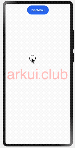
.bindContextMenu(this.MenuBuilder, ResponseType.LongPress) // 长按绑定
}
.padding(10)
.size({ width: "100%", height: '100%' })
}
}
2
3
4
5
6
7
8
9
10
11
12
13
14
15
16
17
18
19
20
21
22
23
24
25
26
27
28
29
30
31
32
33
34
35
36
37
38
39
40
41
42
43
44
45
46
47
48
49
50
51
52
53
54
55
56
57
样例运行结果如下图所示:
# 3.4.3:bindPopup
bindPopup 和 bindMenu 功能类似,从用户角度讲都是弹出一个可选项提示框, bindPopup 定义如下:
declare class CommonMethod<T> {
  bindPopup(show: boolean, popup: PopupOptions | CustomPopupOptions): T;
}
2
3
show:创建
Popup弹窗时是否默认显示,默认值为 false 。popup:
Popup的显示配置,参数支持PopupOptions和CustomPopupOptions两种类型,他们分别如下所示:PopupOptions配置如下:
declare interface PopupOptions {
  message: string;                                         // 显示的信息提示
  placementOnTop?: boolean;                                // 是否显示在组件上方,默认值为 false
  primaryButton?: {                                        // 第一个按钮的配置
    value: string;                                         // 按钮的文字
    action: () => void;                                    // 按钮的点击回调
  };
  secondaryButton?: {                                      // 第二个按钮的配置
    value: string;                                         // 按钮的文字
    action: () => void;                                    // 按钮的事件回调
  };
  onStateChange?: (event: { isVisible: boolean }) => void; // Popup可见性变化的回调
}
1
2
3
4
5
6
7
8
9
10
11
12
13- message:
Popup显示的提示文字。 - placementOnTop:
Popup是否显示在组件上方。 - primaryButton:
Popup显示按钮配置。 - secondaryButton:
Popup显示按钮配置。 - onStateChange:
Popup可见性变化的回调。
简单样例如下所示:
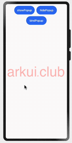
import prompt from '@ohos.prompt';

@Entry @Component struct Index {

  @State showPopup: boolean = false;

  build() {
    Column({space: 10}) {
      Row({space: 10}) {
        Button("showPopup")
          .width(120)
          .height(50)
          .onClick(() => {
            this.showPopup = true;
          })

        Button("hidePopup")
          .width(120)
          .height(50)
          .onClick(() => {
            this.showPopup = false;
          })
      }

      Button("bindPopup")
        .width(120)
        .height(50)
        .bindPopup(this.showPopup, {
          message: "bindPopup测试",
          placementOnTop: true,
          onStateChange: ((state) => {
            prompt.showToast({message: "isVisible: " + state.isVisible})
          }),
          primaryButton: {
            value: "测试1",
            action: () => {
              prompt.showToast({message: "测试1"})
              this.showPopup = !this.showPopup;
            }
          },
          secondaryButton: {
            value: "测试2",
            action: () => {
              prompt.showToast({message: "测试2"})
              this.showPopup = !this.showPopup;
            }
          }
        })
        .onClick(() => {
          this.showPopup = !this.showPopup;
        })
    }
    .padding(10)
    .size({ width: "100%", height: '100%' })
  }
}
1
2
3
4
5
6
7
8
9
10
11
12
13
14
15
16
17
18
19
20
21
22
23
24
25
26
27
28
29
30
31
32
33
34
35
36
37
38
39
40
41
42
43
44
45
46
47
48
49
50
51
52
53
54
55
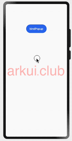
56样例运行结果如下图所示:
- message:
CustomPopupOptions配置如下:
declare interface CustomPopupOptions {
  builder: CustomBuilder;
  placement?: Placement;
  maskColor?: Color | string | Resource | number;
  popupColor?: Color | string | Resource | number;
  enableArrow?: boolean;
  autoCancel?: boolean;
  onStateChange?: (event: { isVisible: boolean }) => void;
}
1
2
3
4
5
6
7
8
9- builder:自定义
Popup。 - placement:
Popup的相对位置。 - maskColor:
Popup蒙层颜色。 - popupColor:
Popup背景颜色。 - enableArrow:
Popup是否显示箭头。 - autoCancel:
Popup是否自动隐藏。 - onStateChange:
Popup可见性变化的回调。
简单样例如下所示:
import prompt from '@ohos.prompt';

@Entry @Component struct Index {

  @Builder PopupBuilder() {
    Row() {
      Text("复制")
        .width(80)
        .height("100%")
        .fontSize(20)
        .fontColor("#ffffff")
        .textAlign(TextAlign.Center)
        .onClick(() => {
          prompt.showToast({message: "复制"});
        })
      Divider()
        .width(1)
        .height("100%")
        .backgroundColor("#aabbcc")
      Text("转发")
        .width(80)
        .height("100%")
        .fontSize(20)
        .fontColor("#ffffff")
        .textAlign(TextAlign.Center)
        .onClick(() => {
          prompt.showToast({message: "转发"});
        })
      Divider()
        .width(1)
        .height("100%")
        .backgroundColor("#aabbcc")
      Text("删除")
        .width(80)
        .height("100%")
        .fontSize(20)
        .fontColor("#ffffff")
        .textAlign(TextAlign.Center)
        .onClick(() => {
          prompt.showToast({message: "删除"});
        })
    }
    .height(45)
  }

  @State showPopup: boolean = false;

  build() {
    Column({space: 10}) {

      Text()
        .width(100)
        .height(100)

      Button("bindPopup")
        .width(120)
        .height(50)
        .bindPopup(this.showPopup, {
          builder: this.PopupBuilder,    // 自定义 UI
          placement: Placement.Bottom,   // 按钮下方显示
          maskColor: "#1a000000",        // 蒙层颜色
          popupColor: "#111111",         // 背景色
          enableArrow: true,             // 显示箭头
          autoCancel: true,              // 设置自动隐藏
          onStateChange: ((state) => {   // 可见性回调。
            console.log("visible: " + state.isVisible);
          })
        })
        .onClick(() => {
          this.showPopup = !this.showPopup;
        })
    }
    .padding(10)
    .size({ width: "100%", height: '100%' })
  }
}
1
2
3
4
5
6
7
8
9
10
11
12
13
14
15
16
17
18
19
20
21
22
23
24
25
26
27
28
29
30
31
32
33
34
35
36
37
38
39
40
41
42
43
44
45
46
47
48
49
50
51
52
53
54
55
56
57
58
59
60
61
62
63
64
65
66
67
68
69
70
71
72
73
74
75
76样例运行结果如下图所示:
- builder:自定义