# 4.9:提示框组件
ArkUI开发框架在 @kit.ArkUI 模块里提供了显示提示框的 API ,这些提示框可分为两类,一类是可交互的提示框组件,以 Dialog 为代表,另一类是不可交互的提示框组件,以 Toast 为代表,本节笔者简单介绍一下这两类弹框的使用。
# 4.9.1:显示一个Toast
Toast 的应用场景也非常广泛,比如网络请求出错了可以弹一个 Toast 提示等。@kit.ArkUI 模块里提供显示一个 Toast 的 API 如下所示:
declare namespace promptAction {
  // 显示一个Toast
  function showToast(options: ShowToastOptions): void;
}

interface ShowToastOptions { // Toast配置参数
  message: string;           // Toast显示文本
  duration?: number;         // Toast显示时长
  bottom?: string | number;  // Toast距离屏幕底部距离
}
2
3
4
5
6
7
8
9
10
- options:设备 Toast 显示特性,
ShowToastOptions参数说明如下:- message:提示文本,必填项。
- duration:Toast 显示时间,单位毫秒,范围 [1500, 10000],默认1500。
- bottom:设置 Toast 的显示位置距离底部的间距。
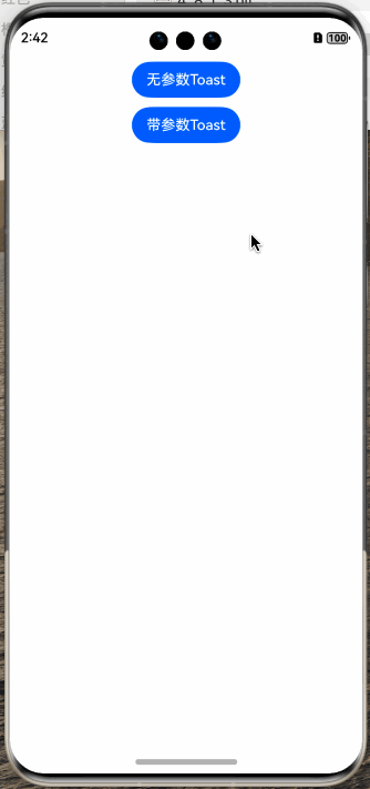
简单样例如下所示:
样例运行结果如下图所示:
# 4.9.2:显示一个Dialog
对话框的使用场景也很高频,比如 APP 上架应用市场要求 APP 首次启动要有服务协议和隐私权限提示弹框等,ArkUI开发框架提供了两种方式显示一个对话框,一种是使用 @kit.ArkUI 模块里提供的 API 显示,另一种是使用全局对话框 AlertDialog 显示。
使用
@ohos.prompt模块里提供的 showDialogdeclare namespace promptAction { // 显示一个对话框 function showDialog(options: ShowDialogOptions, callback: AsyncCallback<ShowDialogSuccessResponse>): void; } interface ShowDialogOptions { // 对话框配置 title?: string; // 标题 message?: string; // 内容 buttons?: Array<Button>; // 按钮 } interface Button { // 对话框按钮配置 text: string; // 按钮文字 color: string; // 按钮颜色 } interface ShowDialogSuccessResponse { // 成功回调 index: number; }1
2
3
4
5
6
7
8
9
10
11
12
13
14
15
16
17
18
19options:显示对话框的配置项,
ShowDialogOptions说明如下:- title:对话框的标题。
- message:对话框的内容。
- buttons:对话框上的按钮,至少配置一个,最多三个。
call:事件回调,并显示对话框的点击下标
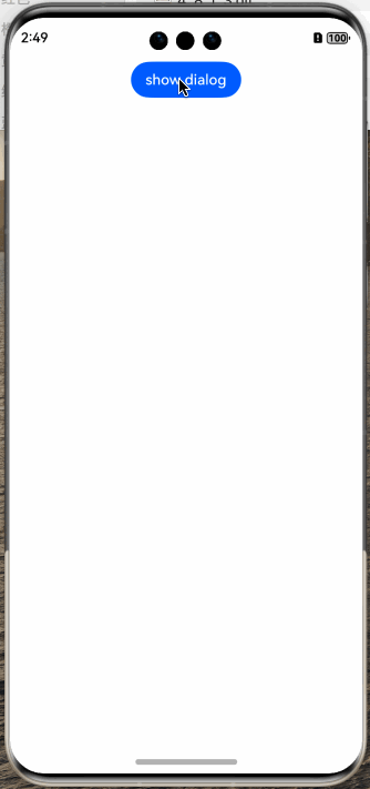
简单样例如下所示:
import { promptAction } from '@kit.ArkUI';

@Entry
@Component
struct ToastTest {

  build() {
    Column({space: 10}) {
      Button("show dialog")
        .onClick(() => {
          this.showDialog()
        })
    }
    .width('100%')
    .height('100%')
    .padding(10)
  }

  private showDialog() {
    promptAction.showDialog({
      title: "对话框标题",
      message: "对话框内容",
      buttons: [
        {
          text: "第一个按钮",
          color: "#aabbcc"
        },
        {
          text: "第二个按钮",
          color: "#bbccaa"
        },
        {
          text: "第三个按钮",
          color: "#ccaabb"
        }
      ]
    }, (error, index) => {
      let msg = error ? JSON.stringify(error) : "index: " + index;
      promptAction.showToast({
        message: msg
      })
    })
  }
}
1
2
3
4
5
6
7
8
9
10
11
12
13
14
15
16
17
18
19
20
21
22
23
24
25
26
27
28
29
30
31
32
33
34
35
36
37
38
39
40
41
42
43
44样例运行结果如下图所示:
使用全局对话框 AlertDialog
除了使用
@kit.ArkUI模块提供的 API 可以显示一个对话框外,还可以使用全局对话框AlertDialog,AlertDialog的源码其定义如下:declare class AlertDialog { // 显示一个对话框 static show(value: AlertDialogParamWithConfirm | AlertDialogParamWithButtons); }1
2
3
4show:显示一个对话框,参数
value支持AlertDialogParamWithConfirm和AlertDialogParamWithButtons,它们都继承自AlertDialogParam,AlertDialogParam定义如下:declare interface AlertDialogParam { title?: ResourceStr; message: ResourceStr; autoCancel?: boolean; cancel?: () => void; alignment?: DialogAlignment; offset?: Offset; gridCount?: number; }1
2
3
4
5
6
7
8
9- title:设置对话框的标题。
- message:设置对话框显示的内容。
- autoCancel:点击蒙层是否隐藏对话框。
- cancel:点击蒙层的事件回调。
- alignment:对话框的对齐方式。
- offset:对话框相对于
alignment的偏移量。 - gridCount:对话框宽度所占用栅格数。
AlertDialogParamWithConfirm表示一个按钮的对话框,SDK 源码如下:declare interface AlertDialogParamWithConfirm extends AlertDialogParam { confirm?: { value: ResourceStr; // 按钮显示文字 fontColor?: ResourceColor; // 按钮文字颜色 backgroundColor?: ResourceColor; // 按钮背景色 action: () => void; // 点击按钮的事件回调 }; }1
2
3
4
5
6
7
8confirm参数的配置说明如下:- value:设置按钮的显示文本。
- fontColor:设置按钮的显示文本的颜色。
- backgroundColor:设置按钮的背景色。
- action:点击按钮的事件回调。
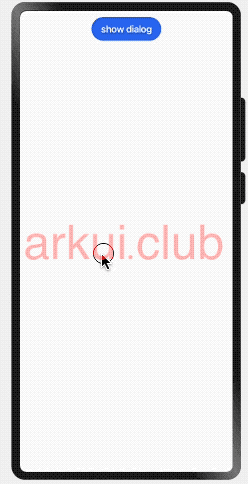
简单样例如下所示:
import { promptAction } from '@kit.ArkUI';

@Entry
@Component
struct PromptTest {
  build() {
    Column({ space: 10 }) {
      Button("show dialog")
        .onClick(() => {
          AlertDialog.show({
            title: "对话框标题",
            message: "对话框内容",
            autoCancel: true,                  // 点击蒙层,隐藏对话框
            cancel: () => {                    // 点击蒙层的事件回调
              promptAction.showToast({
                message: "点击蒙层消失"
              })
            },
            alignment: DialogAlignment.Bottom, // 设置对话框底部对齐
            offset: { dx: 0, dy: -20},         // 在Y轴方向上的偏移量
            confirm: {
              value: "确定按钮",
              fontColor: "#ff0000",
              backgroundColor: "#ccaabb",
              action: () => {
                promptAction.showToast({
                  message: "点击按钮消失"
                })
              }
            }
          });
        })
    }
    .width('100%')
    .height('100%')
    .padding(10)
  }
}
1
2
3
4
5
6
7
8
9
10
11
12
13
14
15
16
17
18
19
20
21
22
23
24
25
26
27
28
29
30
31
32
33
34
35
36
37
38样例运行结果如下图所示:
AlertDialogParamWithButtons表示两个按钮的对话框,SDK 源码如下:declare interface AlertDialogParamWithButtons extends AlertDialogParam { primaryButton: { value: ResourceStr; fontColor?: ResourceColor; backgroundColor?: ResourceColor; action: () => void; }; secondaryButton: { value: ResourceStr; fontColor?: ResourceColor; backgroundColor?: ResourceColor; action: () => void; }; }1
2
3
4
5
6
7
8
9
10
11
12
13
14
15
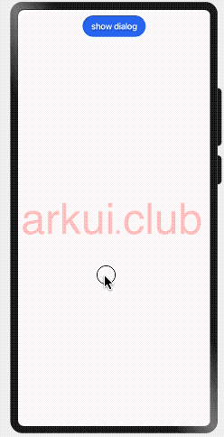
16primaryButton和secondaryButton的参数配置同AlertDialogParamWithConfirm的按钮配置,笔者就不再重复了,简单样例如下所示:import { promptAction } from '@kit.ArkUI'; @Entry @Component struct PromptTest { build() { Column({ space: 10 }) { Button("show dialog") .onClick(() => { AlertDialog.show({ title: "对话框标题", message: "对话框内容", autoCancel: true, cancel: () => { promptAction.showToast({ message: "点击蒙层消失" }) }, alignment: DialogAlignment.Bottom, offset: { dx: 0, dy: -20}, primaryButton: { value: "primaryButton", fontColor: "#ff0000", backgroundColor: "#ccaabb", action: () => { promptAction.showToast({ message: "点击primaryButton" }) } }, secondaryButton: { value: "secondaryButton按钮", fontColor: "#ff0000", backgroundColor: "#ccaabb", action: () => { promptAction.showToast({ message: "点击secondaryButton" }) } } }); }) } .width('100%') .height('100%') .padding(10) } }1
2
3
4
5
6
7
8
9
10
11
12
13
14
15
16
17
18
19
20
21
22
23
24
25
26
27
28
29
30
31
32
33
34
35
36
37
38
39
40
41
42
43
44
45
46
47样例运行结果如下图所示:
📢:
AlertDialog提供的全局对话框支持的样式有限,如果要实现自由样式的Dialog可使用自定义对话框的方式,读者请参考自定义组件章节里的自定义对话框部分。
# 4.9.3:显示一个Menu
对话框的使用场景也很高频,比如 APP 上架应用市场要求 APP 首次启动要有服务协议和隐私权限提示弹框等,@ohos.prompt 模块里提供显示一个 Menu 的 API 如下所示:
declare namespace prompt {
  // 显示menu
  function showActionMenu(options: ActionMenuOptions, callback: AsyncCallback<ActionMenuSuccessResponse>):void;
}
// menu事件回调
interface ActionMenuSuccessResponse {
  index: number;
}

// menu配置
interface ActionMenuOptions {

  title?: string;

  buttons: [Button, Button?, Button?, Button?, Button?, Button?];
}
2
3
4
5
6
7
8
9
10
11
12
13
14
15
16
- options:显示
Menu的配置项,ActionMenuOptions参数说明如下:- title:
Menu的显示标题。 - buttons:
Menu显示的按钮数组,至少 1 个按钮,至多 6 个按钮。
- title:
- callback:事件回调。
简单样例如下所示:
import { promptAction } from '@kit.ArkUI';

@Entry
@Component
struct MenuTest {

  build() {
    Column({space: 10}) {
      Button("show menu")
        .onClick(() => {
          promptAction.showActionMenu({   // 显示一个菜单栏
            title: "ActionMenu标题", // 设置标题
            buttons: [              // 设置选项
              {
                text: "按钮1",
                color: "#aabbcc"
              },
              {
                text: "按钮2",
                color: "#bbccaa"
              },
              {
                text: "按钮3",
                color: "#ccaabb"
              }
            ]
          }, (error, index) => {    // 事件回调
            let msg = error ? JSON.stringify(error) : "index: " + index;
            promptAction.showToast({
              message: msg
            })
          })
        })
    }
    .width('100%')
    .height('100%')
    .padding(10)
  }
}
2
3
4
5
6
7
8
9
10
11
12
13
14
15
16
17
18
19
20
21
22
23
24
25
26
27
28
29
30
31
32
33
34
35
36
37
38
39
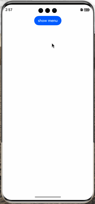
样例运行结果如下图所示:
← 4.8:开关组件 4.10:滑动条组件 →