4.10:滑动条组件
项目开发中可能会有设置设备音量大小,调节屏幕亮度等需求,实现类似需求一般都会使用到滑动条,ArkUI开发框架提供了滑动组件 Slider ,本节笔者介绍一下它的简单使用。
4.10.1:Slider定义介绍
interface SliderInterface {
(options?: SliderOptions): SliderAttribute;
}
declare interface SliderOptions {
value?: number;
min?: number;
max?: number;
step?: number;
style?: SliderStyle;
direction?: Axis;
reverse?: boolean;
}
1
2
3
4
5
6
7
8
9
10
11
12
13
14
- options:
Slider 接收一个 SliderOptions 类型的可选参数 options ,SliderOptions 参数说明如下:
- value:滑动条当前进度值。
- min:设置滑动条设置最小值。
- max:设置滑动条设置最大值,默认为 100 。
- step:设置滑动条滑动跳动值,当设置相应的 step 时,Slider为间歇滑动。
- style:设置滑动条的滑块样式。
- direction:设置滑动条滑动方向为水平或竖直方向。
- reverse:设置滑动条取值范围是否反向。
简单样例如下所示:
@Entry @Component struct Index {

  build() {
    Column({space: 10}) {
      Slider({
        value: 20,
        min: 0,
        max: 100,
        step: 1,
        style: SliderStyle.InSet,
        direction: Axis.Horizontal,
        reverse: false
      })
      .width(260)
      .height(60)
      .backgroundColor(Color.Pink)

      Slider({
        value: 20,
        min: 0,
        max: 100,
        step: 10,
        style: SliderStyle.OutSet,
        direction: Axis.Horizontal,
        reverse: false
      })
      .width(260)
      .height(60)
      .backgroundColor(Color.Pink)
    }
    .padding(10)
    .size({ width: "100%", height: '100%' })
  }
}
1
2
3
4
5
6
7
8
9
10
11
12
13
14
15
16
17
18
19
20
21
22
23
24
25
26
27
28
29
30
31
32
33
34
@Entry @Component class MyView {

    func build() {
      Column(10) {
        Slider(
          value: 20.0,
          min: 0.0,
          max: 100.0,
          step: 1.0,
          style: SliderStyle.InSet,
          direction: Axis.Horizontal,
          reverse: false
        )
        .width(260)
        .height(60)
        .backgroundColor(0xffc0cb)

        Slider(
          value: 20.0,
          min: 0.0,
          max: 100.0,
          step: 10.0,
          style: SliderStyle.OutSet,
          direction: Axis.Horizontal,
          reverse: false
        )
        .width(260)
        .height(60)
        .backgroundColor(0xffc0cb)
      }
      .padding(10)
      .width(100.percent)
      .height(100.percent)
    }
}
1
2
3
4
5
6
7
8
9
10
11
12
13
14
15
16
17
18
19
20
21
22
23
24
25
26
27
28
29
30
31
32
33
34
35
样例运行结果如下图所示:

4.10.2:Slider属性介绍
declare class SliderAttribute extends CommonMethod<SliderAttribute> {
  blockColor(value: ResourceColor): SliderAttribute;
  trackColor(value: ResourceColor): SliderAttribute;
  selectedColor(value: ResourceColor): SliderAttribute;
  minLabel(value: string): SliderAttribute;
  maxLabel(value: string): SliderAttribute;
  showSteps(value: boolean): SliderAttribute;
  showTips(value: boolean): SliderAttribute;
  trackThickness(value: Length): SliderAttribute;
}
1
2
3
4
5
6
7
8
9
10
4.10.3:Slider事件介绍
declare class SliderAttribute extends CommonMethod<SliderAttribute> {
  onChange(callback: (value: number, mode: SliderChangeMode) => void): SliderAttribute;
}
1
2
3
- onChange:滑动条滑动时触发事件回调,
value 表示当前进度值;mode 表示滑动条的拖动状态,SliderChangeMode 定义了以下 3 种类型:
- Begin:用户开始拖动滑块。
- Moving:用户拖动滑块中。
- End:用户结束拖动滑块。
📢: Slider 组件支持的通用事件只有 onAppear() 和 onDisAppear() 这俩方法。
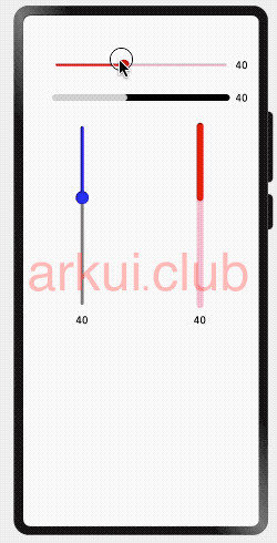
4.10.4:Slider完整样例
@Entry @Component struct SliderTest {

  @State outSetValue: number = 40
  @State inSetValue: number = 40
  @State outVerticalSetValue: number = 40
  @State inVerticalSetValue: number = 40

  build() {
    Column({ space: 10 }) {
      Row() {
        Slider({
          value: this.outSetValue,
          min: 0,
          max: 100,
          step: 1,
          style: SliderStyle.OutSet
        })
          .blockColor(Color.Red)
          .selectedColor(Color.Red)
          .trackColor(Color.Pink)
          .showSteps(true)
          .showTips(true)
          .trackThickness(4)
          .onChange((value: number, mode: SliderChangeMode) => {
            this.outSetValue = value
          })
        Text(this.outSetValue.toFixed(0))
          .fontSize(16)
      }
      .padding({ top: 50 })
      .width('80%')

      Row() {
        Slider({
          value: this.inSetValue,
          min: 0,
          max: 100,
          step: 1,
          style: SliderStyle.InSet
        })
          .blockColor(0xCCCCCC)
          .trackColor(Color.Black)
          .trackThickness(10)
          .selectedColor(0xCCCCCC)
          .showSteps(false)
          .showTips(false)
          .onChange((value: number, mode: SliderChangeMode) => {
            this.inSetValue = value
          })
        Text(this.inSetValue.toFixed(0))
          .fontSize(16)
      }
      .width('80%')

      Row() {
        Column() {
          Slider({
            value: this.outVerticalSetValue,
            min: 0,
            max: 100,
            step: 1,
            style: SliderStyle.OutSet,
            direction: Axis.Vertical
          })
            .blockColor(Color.Blue)
            .trackColor(Color.Gray)
            .selectedColor(Color.Blue)
            .trackThickness(5)
            .showSteps(true)
            .showTips(true)
            .onChange((value: number, mode: SliderChangeMode) => {
              this.outVerticalSetValue = value
            })
          Text(this.outVerticalSetValue.toFixed(0))
            .fontSize(16)
        }.width('50%').height(300)

        Column() {
          Slider({
            value: this.inVerticalSetValue,
            min: 0,
            max: 100,
            step: 1,
            style: SliderStyle.InSet,
            direction: Axis.Vertical
          })
            .blockColor(Color.Red)
            .trackColor(Color.Pink)
            .selectedColor(Color.Red)
            .showSteps(false)
            .showTips(false)
            .trackThickness(10)
            .onChange((value: number, mode: SliderChangeMode) => {
              this.inVerticalSetValue = value
            })
          Text(this.inVerticalSetValue.toFixed(0))
            .fontSize(16)
        }.width('50%').height(300)
      }
    }.width('100%').margin({ top: 5 })
  }
}
1
2
3
4
5
6
7
8
9
10
11
12
13
14
15
16
17
18
19
20
21
22
23
24
25
26
27
28
29
30
31
32
33
34
35
36
37
38
39
40
41
42
43
44
45
46
47
48
49
50
51
52
53
54
55
56
57
58
59
60
61
62
63
64
65
66
67
68
69
70
71
72
73
74
75
76
77
78
79
80
81
82
83
84
85
86
87
88
89
90
91
92
93
94
95
96
97
98
99
100
101
102
@Entry @Component class MyView {

    @State var outSetValue = 40.0
    @State var inSetValue = 40.0
    @State var outVerticalSetValue = 40.0
    @State var inVerticalSetValue = 40.0

    func build() {
      Column(10) {
        Row() {
          Slider(
            value: this.outSetValue,
            min: 0.0,
            max: 100.0,
            step: 1.0,
            style: SliderStyle.OutSet
          )
          .blockColor(0xff0000)
          .selectedColor(0xff0000)
          .trackColor(0xffc0cb)
          .showSteps(true)
          .showTips(true)
          .trackThickness(4)
          .onChange({ value: Float64, mode: SliderChangeMode =>
            this.outSetValue = value
          })
          Text("${this.outSetValue}")
            .fontSize(16)
        }
        .padding(top: 50)
        .width(80.percent)

        Row() {
          Slider(
            value: this.inSetValue,
            min: 0.0,
            max: 100.0,
            step: 1.0,
            style: SliderStyle.InSet
          )
          .blockColor(0xCCCCCC)
          .trackColor(0x000000)
          .trackThickness(10)
          .selectedColor(0xCCCCCC)
          .showSteps(false)
          .showTips(false)
          .onChange({ value: Float64 , mode: SliderChangeMode =>
            this.inSetValue = value
          })

          Text("${this.inSetValue}")
            .fontSize(16)
        }
        .width(80.percent)

        Row() {
          Column() {
            Slider(
              value: this.outVerticalSetValue,
              min: 0.0,
              max: 100.0,
              step: 1.0,
              style: SliderStyle.OutSet,
              direction: Axis.Vertical
            )
            .blockColor(0xaabbcc)
            .trackColor(0xdddddd)
            .selectedColor(0xaabbcc)
            .trackThickness(5)
            .showSteps(true)
            .showTips(true)
            .onChange({ value: Float64, mode: SliderChangeMode =>
              this.outVerticalSetValue = value
            })

            Text("${this.outVerticalSetValue}")
              .fontSize(16)
          }
          .width(50.percent)
          .height(300.vp)

          Column() {
            Slider(
              value: this.inVerticalSetValue,
              min: 0.0,
              max: 100.0,
              step: 1.0,
              style: SliderStyle.InSet,
              direction: Axis.Vertical
            )
            .blockColor(0xff0000)
            .trackColor(0xffc0cb)
            .selectedColor(0xff0000)
            .showSteps(false)
            .showTips(false)
            .trackThickness(10)
            .onChange({ value: Float64, mode: SliderChangeMode =>
              this.inVerticalSetValue = value
            })

            Text("${this.inVerticalSetValue}")
              .fontSize(16)
          }
          .width(50.percent)
          .height(300.vp)
        }
      }
      .padding(10)
      .width(100.percent)
      .height(100.percent)
    }
}
1
2
3
4
5
6
7
8
9
10
11
12
13
14
15
16
17
18
19
20
21
22
23
24
25
26
27
28
29
30
31
32
33
34
35
36
37
38
39
40
41
42
43
44
45
46
47
48
49
50
51
52
53
54
55
56
57
58
59
60
61
62
63
64
65
66
67
68
69
70
71
72
73
74
75
76
77
78
79
80
81
82
83
84
85
86
87
88
89
90
91
92
93
94
95
96
97
98
99
100
101
102
103
104
105
106
107
108
109
110
111
112
样例运行结果如下图所示:
(adsbygoogle = window.adsbygoogle || []).push({});