# 4.2:按钮组件
Button 组件也是基础组件之一,和其它基础组件不同的是 Button 组件允许添加一个子组件来实现不同的展示样式。
# 4.2.1:Button定义介绍
interface ButtonInterface {
  (): ButtonAttribute;
  (options: ButtonOptions): ButtonAttribute;
  (label: ResourceStr, options?: ButtonOptions): ButtonAttribute;
}
1
2
3
4
5
2
3
4
5
label:设置按钮文字,简单样例如下所示:
@Entry @Component struct Index {
  build() {
    Column({space: 10}) {
      Row({space: 10}) {
        Button('test')

        Button('test')
          .backgroundColor(Color.Pink)
      }
    }
    .alignItems(HorizontalAlign.Start)
    .width('100%')
    .height('100%')
    .padding(10)
  }
}
1
2
3
4
5
6
7
8
9
10
11
12
13
14
15
16@Entry @Component class MyView { func build() { Column(10) { Row(10) { Button('test') Button('test') .backgroundColor(Color(0xffc0cb)) } } .alignItems(HorizontalAlign.Start) .width(100.percent) .height(100.percent) .padding(10) } }1
2
3
4
5
6
7
8
9
10
11
12
13
14
15
16样例运行结果如下图所示:

type:设置
Button按钮的显示样式,ButtonType定义了以下3种样式:Capsule(默认值):胶囊类型,圆角值为
Button高度的一半并且不允许修改,此时通过设置 borderRadius() 的方式设置圆角则无效。简单样例如下所示:@Entry @Component struct Index { build() { Column({space: 10}) { Row({space: 10}) { Button('test') .height(40) .width(90) .backgroundColor('#aabbcc') Button('test', {type: ButtonType.Capsule}) .height(40) .width(90) .borderRadius(20) // 设置圆角,但是没有效果 .borderWidth(3) // 设置边框宽度 .borderColor(Color.Red) // 设置边框颜色 .backgroundColor('#bbaacc')// 设置背景色 } } .alignItems(HorizontalAlign.Start) .width('100%') .height('100%') .padding(10) } }1
2
3
4
5
6
7
8
9
10
11
12
13
14
15
16
17
18
19
20
21
22
23
24@Entry @Component class MyView { func build() { Column(10) { Row(10) { Button('test') .height(40) .width(90) .backgroundColor(0xaabbcc) Button('test') .height(40) .shape(ShapeType.Capsule) .width(90) .borderRadius(20) // 设置圆角,但是没有效果 .borderWidth(3) // 设置边框宽度 .borderColor(0xff0000) // 设置边框颜色 .backgroundColor(0xbbaacc) // 设置背景色 } } .alignItems(HorizontalAlign.Start) .width(100.percent) .height(100.percent) .padding(10) } }1
2
3
4
5
6
7
8
9
10
11
12
13
14
15
16
17
18
19
20
21
22
23
24
25样例运行结果如下图所示:

Normal:矩形按钮,无圆角,可以通过 borderRadius() 设置圆角大小,不支持通过 border() 的方式设置圆角,简单样例如下所示:
@Entry @Component struct Index {
  build() {
    Column({space: 10}) {
      Row({space: 10}) {
        Button('Login')                            // 默认胶囊类型
          .height(40)
          .width(90)
          .backgroundColor('#aabbcc')

        Button('Login', {type: ButtonType.Normal}) // 没有圆角
          .height(40)
          .width(90)
          .backgroundColor('#aabbcc')

        Button('Login', {type: ButtonType.Normal}) // 设置圆角
          .height(40)
          .width(90)
          .backgroundColor('#aabbcc')
          .borderRadius(8)
      }
    }
    .alignItems(HorizontalAlign.Start)
    .width('100%')
    .height('100%')
    .padding(10)
  }
}
1
2
3
4
5
6
7
8
9
10
11
12
13
14
15
16
17
18
19
20
21
22
23
24
25
26
27@Entry @Component class MyView { func build() { Column(10) { Row(10) { Button('Login') // 默认胶囊类型 .height(40) .width(90) .backgroundColor(0xaabbcc) Button('Login') .height(40) .shape(ShapeType.Normal) // 没有圆角 .width(90) .backgroundColor(0xaabbcc) Button('Login') // 设置圆角 .height(40) .width(90) .shape(ShapeType.Normal) // 没有圆角 .backgroundColor(0xaabbcc) .borderRadius(8) } } .alignItems(HorizontalAlign.Start) .width(100.percent) .height(100.percent) .padding(10) } }1
2
3
4
5
6
7
8
9
10
11
12
13
14
15
16
17
18
19
20
21
22
23
24
25
26
27
28
29样例运行结果如下图所示:

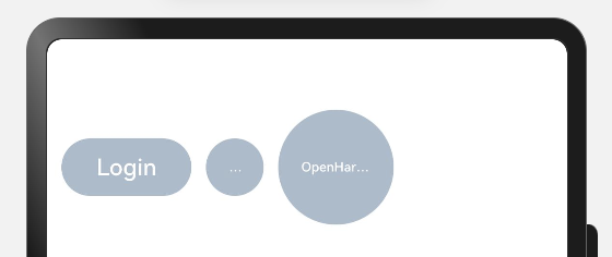
Circle:圆形按钮,设置该样式时,简单样例如下所示:
@Entry @Component struct Index {
  build() {
    Column({space: 10}) {
      Row({space: 10}) {
        Button('Login')
          .height(40)
          .width(90)
          .backgroundColor('#aabbcc')

        Button('Harmony', {type: ButtonType.Circle})
          .backgroundColor('#aabbcc')

        Button('OpenHarmony', {type: ButtonType.Circle})
          .height(80)
          .width(90)
          .backgroundColor('#aabbcc')
      }
    }
    .alignItems(HorizontalAlign.Start)
    .width('100%')
    .height('100%')
    .padding(10)
  }
}
1
2
3
4
5
6
7
8
9
10
11
12
13
14
15
16
17
18
19
20
21
22
23
24@Entry @Component class MyView { func build() { Column(10) { Row(10) { Button('Login') .height(40) .width(90) .backgroundColor(0xaabbcc) Button('Harmony') .backgroundColor(0xaabbcc) .shape(ShapeType.CircleType) Button('OpenHarmony') .height(80) .width(90) .shape(ShapeType.CircleType) .backgroundColor(0xaabbcc) } } .alignItems(HorizontalAlign.Start) .width(100.percent) .height(100.percent) .padding(10) } }1
2
3
4
5
6
7
8
9
10
11
12
13
14
15
16
17
18
19
20
21
22
23
24
25
26样例运行结果如下图所示:
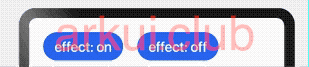
stateEffect:设置是否开启点击效果,默认开启,简单样例如下所示:
Button('effect: on')
  .fontSize(20)

Button('effect: off', {stateEffect: false})
  .fontSize(20)
1
2
3
4
5@Entry @Component class MyView { func build() { Column(10) { Row(10) { Button('effect: on') .fontSize(20) Button('effect: off') .stateEffect(false) .fontSize(20) } } .alignItems(HorizontalAlign.Start) .width(100.percent) .height(100.percent) .padding(10) } }1
2
3
4
5
6
7
8
9
10
11
12
13
14
15
16
17
18样例运行结果如下图所示:
# 4.2.2:Button自定义样式
包含
Text组件@Entry @Component struct Index { build() { Column({space: 10}) { Row({space: 10}) { Button({type: ButtonType.Normal}) { Text('Login') .fontSize(20) .fontColor(Color.Red) .padding({left: 20, right: 20}) } .borderRadius(8) .backgroundColor("#aabbcc") Button({type: ButtonType.Circle}) { Text('Login') .fontSize(20) .fontColor(Color.Red) } .width(80) .height(80) .backgroundColor("#aabbcc") } } .alignItems(HorizontalAlign.Start) .width('100%') .height('100%') .padding(10) } }1
2
3
4
5
6
7
8
9
10
11
12
13
14
15
16
17
18
19
20
21
22
23
24
25
26
27
28
29@Entry @Component class MyView { func build() { Column(10) { Row(10) { Button() { Text('Login') .fontSize(20) .fontColor(0xff0000) .padding(left: 20, right: 20) } .shape(ShapeType.Normal) .borderRadius(8) .backgroundColor(0xaabbcc) Button() { Text('Login') .fontSize(20) .fontColor(0xff0000) } .width(80) .height(80) .shape(ShapeType.CircleType) .backgroundColor(0xaabbcc) } } .alignItems(HorizontalAlign.Start) .width(100.percent) .height(100.percent) .padding(10) } }1
2
3
4
5
6
7
8
9
10
11
12
13
14
15
16
17
18
19
20
21
22
23
24
25
26
27
28
29
30
31样例运行结果如下图所示:
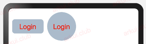
样例给
Button添加了一个Text子组件,通过设置Text的文本样式达到修改Button文字的效果。包含
Image组件@Entry @Component struct Index { build() { Column({space: 10}) { Row({space: 10}) { Button({type: ButtonType.Circle}) { Image($r("app.media.more")) .width(30) .height(30) } .width(70) .height(70) Button({type: ButtonType.Circle}) { Image($r("app.media.delete")) .width(40) .height(40) } .width(70) .height(70) .backgroundColor('#ff0000') } } .alignItems(HorizontalAlign.Start) .width('100%') .height('100%') .padding(10) } }1
2
3
4
5
6
7
8
9
10
11
12
13
14
15
16
17
18
19
20
21
22
23
24
25
26
27
28@Entry @Component class MyView { func build() { Column(10) { Row(10) { Button() { Image(@r(app.media.more)) .width(30) .height(30) } .width(70) .height(70) .shape(ShapeType.CircleType) Button() { Image(@r(app.media.delete)) .width(40) .height(40) } .width(70) .height(70) .shape(ShapeType.CircleType) .backgroundColor(0xff0000) } } .alignItems(HorizontalAlign.Start) .width(100.percent) .height(100.percent) .padding(10) } }1
2
3
4
5
6
7
8
9
10
11
12
13
14
15
16
17
18
19
20
21
22
23
24
25
26
27
28
29
30样例运行结果如下图所示:
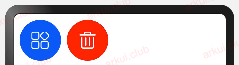
样例中使用了
Image组件,该组件是后续章节要讲解的基础组件,读者们先了解一下。包含复杂组件
@Entry @Component struct Index {
  build() {
    Column({space: 10}) {
      Row({space: 10}) {
        Button({type: ButtonType.Normal}) {
          Row() {
            Image($r("app.media.loading"))
              .width(30)
              .height(30)
              .margin({left: 12})
            Text('loading')
              .fontSize(20)
              .fontColor($r('sys.color.white'))
              .margin({left: 5, right: 12})
          }
          .margin(10)
        }
        .borderRadius(8)
        .backgroundColor(0x317aff)
      }
    }
    .alignItems(HorizontalAlign.Start)
    .width('100%')
    .height('100%')
    .padding(10)
  }
}
1
2
3
4
5
6
7
8
9
10
11
12
13
14
15
16
17
18
19
20
21
22
23
24
25
26
27@Entry @Component class MyView { func build() { Column(10) { Row(10) { Button() { Row() { Image(@r(app.media.loading)) .width(30) .height(30) .margin(left: 12) Text('loading') .fontSize(20) .fontColor(0xffffff) .margin(left: 5, right: 12) } .margin(10) } .shape(ShapeType.Normal) .borderRadius(8) .backgroundColor(0x317aff) } } .alignItems(HorizontalAlign.Start) .width(100.percent) .height(100.percent) .padding(10) } }1
2
3
4
5
6
7
8
9
10
11
12
13
14
15
16
17
18
19
20
21
22
23
24
25
26
27
28
29样例运行结果如下图所示:

样例中使用
Row作为子组件,Row组件属于线性容器组件,它可以添加多个子组件,后续章节我们会详细介绍,读者们先知道这样用就可以了。
(adsbygoogle = window.adsbygoogle || []).push({});

请作者喝杯咖啡
©arkui.club版权所有,禁止私自转发、克隆网站。

