# 3.8:多态设置
# 3.8.1:多种状态样式设置
export declare class CommonMethod<T> {
  stateStyles(value: StateStyles): T;
}

declare interface StateStyles {
  normal?: any;
  pressed?: any;
  disabled?: any;
  focused?: any;
  clicked?: any;
}
1
2
3
4
5
6
7
8
9
10
11
2
3
4
5
6
7
8
9
10
11
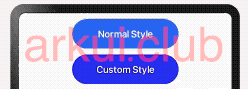
设置组件在不同状态下的显示样式,目前只支持通用属性, StateStyle 定义了以下几种状态:
- normal:设置组件默认情况下的显示样式。
- pressed:设置组件按下时的显示样式。
- disabled:设置组件不可用时的显示样式。
- focused:设置组件获取焦点时的显示样式。
- clicked:设置组件点击时的显示样式。
简单样例如下图所示:
@Entry @Component struct Index {

  build() {
    Column({space: 10}) {
      Button("Normal Style")
        .width(180)
        .height(50)

      Button("Custom Style")
        .width(180)
        .height(50)
        .stateStyles({
          normal: { // 设置默认情况下的显示样式
            .backgroundColor(Color.Blue)
          },
          pressed: { // 设置手指摁下时的显示样式
            .backgroundColor(Color.Pink)
          }
        })
    }
    .padding(10)
    .width("100%")
    .height("100%")
  }
}
1
2
3
4
5
6
7
8
9
10
11
12
13
14
15
16
17
18
19
20
21
22
23
24
25
2
3
4
5
6
7
8
9
10
11
12
13
14
15
16
17
18
19
20
21
22
23
24
25
样例运行结果如下图所示:
# 3.8.2:@Styles样式设置
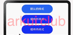
@Styles 作用是提取组件的公共样式,方便其他组件复用样式,它可以定义在组件内部或者组件外部,当定义在组件外部时需要添加 funcition 关键字,简单样例如下所示:
@Styles 作用是提取组件的公共样式,方便其他组件复用样式,它可以定义在组件内部或者组件外部,当定义在组件外部时需要添加 funcition 关键字,简单样例如下所示:
@Styles function btnGlobalPressedStyle() { // 组件外定义的按钮摁下的样式
  .backgroundColor(Color.Pink)
  .width(180)
  .height(50)
}

@Styles function btnGlobalNormalStyle() {  // 组件外定义的按钮默认的样式
  .backgroundColor(Color.Blue)
  .width(180)
  .height(50)
}


@Entry @Component struct Index {

  @Styles btnPressStyle() {                // 组件内定义的按钮摁下的样式
    .backgroundColor(Color.Pink)
    .width(180)
    .height(50)
  }

  @Styles btnNormalStyle() {                // 组件内定义的按钮默认的样式
    .backgroundColor(Color.Blue)
    .width(180)
    .height(50)
  }

  build() {
    Column({space: 10}) {

      Button("默认的样式")
        .width(180)
        .height(50)

      Button("组件外样式")
        .stateStyles({
          normal: btnGlobalNormalStyle,     // 使用组件外定义的按钮默认的样式
          pressed: btnGlobalPressedStyle    // 使用组件外定义的按钮摁下的样式
        })

      Button("组件内样式")
        .stateStyles({
          normal: this.btnNormalStyle,      // 使用组件内定义的按钮默认的样式
          pressed: this.btnPressStyle       // 使用组件内定义的按钮摁下的样式
        })
    }
    .width('100%')
    .height('100%')
    .padding(10)
  }
}
1
2
3
4
5
6
7
8
9
10
11
12
13
14
15
16
17
18
19
20
21
22
23
24
25
26
27
28
29
30
31
32
33
34
35
36
37
38
39
40
41
42
43
44
45
46
47
48
49
50
51
2
3
4
5
6
7
8
9
10
11
12
13
14
15
16
17
18
19
20
21
22
23
24
25
26
27
28
29
30
31
32
33
34
35
36
37
38
39
40
41
42
43
44
45
46
47
48
49
50
51
样例运行结果如下图所示:
# 3.8.3:@Extend样式设置
在 UI 构建中,如果组件设置的属性都是相同的,比如 Text 组件的 fontColor、fontSize 等设置都一致,那么可以使用 @Extend 对 Text 组件进行扩展,提取相同的属性部分,这样可以有效降低代码量。简单样例如下所示:
@Extend(Text) function textStyle(size: number = 20, color: ResourceColor = Color.Black, bgColor: ResourceColor = Color.Pink) {
  .fontSize(size)
  .fontColor(color)
  .backgroundColor(bgColor)
  .fontStyle(FontStyle.Italic)
  .fontWeight(FontWeight.Bold)
}

@Entry @Component struct Test {

  build() {
    Column({ space: 10 }) {
      Text("Extend")
        .textStyle()

      Text("Extend")
        .textStyle(30, Color.Brown, "#aabbcc")
    }
    .width('100%')
    .height("100%")
    .padding(10)
  }
}
1
2
3
4
5
6
7
8
9
10
11
12
13
14
15
16
17
18
19
20
21
22
23
2
3
4
5
6
7
8
9
10
11
12
13
14
15
16
17
18
19
20
21
22
23
样例运行结果如下图所示:

📢:@Extend 装饰器不能定义在 struct 内部,暂时无法在其它页面引入 Extend 样式。
# 3.8.4:渐变设置
export declare class CommonMethod<T> {
  linearGradient(value: {
    angle?: number | string;
    direction?: GradientDirection;
    colors: Array<any>;
    repeating?: boolean;
  }): T;
}
1
2
3
4
5
6
7
8
2
3
4
5
6
7
8
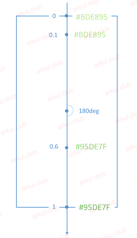
设置组件的渐变样式,参数说明如下:
angle:设置渐变的角度。
direction:设置渐变方向,是angle的抽象
colors:渐变颜色数组,例如设置如下:
简单代码如下所示:
组件渐变色方向旋转
180°,在 [0 ~ 0.1] 区间渐变色为#BDE895,在 [0.1, 0.6] 区间渐变色由#BDE895线性渐变成#95DE7F,在 [0.6, 1.0] 区间渐变色由#95DE7F线性渐变成#7AB967。repeating:是否重复渲染。
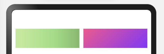
简单样例如下图所示:
样例运行结果如下图所示:

请作者喝杯咖啡
©arkui.club版权所有,禁止私自转发、克隆网站。

