# 9.2:自定义圆环(Ring)
圆环实现起来很简单,笔者分别通过组合现有控件和通过 Canvas 自绘制的方式向读者介绍如何实现一个自定义组件,通过本节的学习,读者可以掌握向自定义组件传值的方法和回顾 Canvas 的使用。
# 9.2.1:组合方式
采用组合的方式实现圆环很简单,只需要 2 个 Circle 组件堆叠在一起即可。
创建组件类
Ring@ComponentV2 export struct Ring { build() { } }1
2
3
4- @ComponentV2:表示
Ring是一个组件,当使用该修饰符时,必须实现build()方法,当组件创建或者后续有状态更新时会调用该方法,我们只需要在build()方法内返回布局即可。 - export:表示当前组件可以导出让外界调用。
- @ComponentV2:表示
实现
Ring组件的布局@ComponentV2 export struct Ring { build() { Stack({alignContent: Alignment.Center}) { Circle() // 大圆充满父布局 .width('100%') .height('100%') Circle() // 小圆居中显示 .width(83) .height(83) .fill(Color.White) // 填充白色 } .width(90) // 宽高相等 .height(90) // 宽高相等 } }1
2
3
4
5
6
7
8
9
10
11
12
13
14
15
16预览结果如下所示:

目前通过堆叠的方式实现了
Ring组件,但是这个圆环不能设置颜色和大小,因此接下来我们需要定义一下圆环的具有的属性。定义圆环属性
RingAttributeclass RingAttribute { radius: number = 45; // 圆环半径,默认45 width: number = 5; // 圆环宽度,默认5 color:Color | number | string | Resource = '#000000'; // 圆环颜色,默认黑色 solid:Color | number | string | Resource = '#ffffff'; // 填充颜色,默认白色 /** * 对非法参数进行过滤 */ public static filter(ringAttribute: RingAttribute): RingAttribute { if (null == ringAttribute || undefined == ringAttribute) { ringAttribute = new RingAttribute(); } else { var defaultAttribute: RingAttribute = new RingAttribute(); if (undefined == ringAttribute.color) { ringAttribute.color = defaultAttribute.color; } if (undefined == ringAttribute.width) { ringAttribute.width = defaultAttribute.width; } if (undefined == ringAttribute.radius) { ringAttribute.radius = defaultAttribute.radius; } if (undefined == ringAttribute.solid) { ringAttribute.solid = defaultAttribute.solid; } } return ringAttribute; } }1
2
3
4
5
6
7
8
9
10
11
12
13
14
15
16
17
18
19
20
21
22
23
24
25
26
27
28
29
30
31圆环的属性定义后又定义了一个静态方法
filter(),目的是过滤参数,如果外界没有传递对应的属性就使用默认值,接下来在Ring组件里边使用它即可。使用圆环属性
RingAttribute@Component export struct Ring { public ringAttribute: RingAttribute = null; build() { Stack({alignContent: Alignment.Center}) { Circle() .width('100%') .height('100%') .fill(this.ringAttribute.color) Circle() .width((this.ringAttribute.radius * 2 - this.ringAttribute.width)) .height((this.ringAttribute.radius * 2 - this.ringAttribute.width)) .fill(this.ringAttribute.solid) } .width(this.ringAttribute.radius * 2) .height(this.ringAttribute.radius * 2) } /** * 该方法在build方法执行前先执行,我们可以在这里对参数进行校验 */ private aboutToAppear() { this.ringAttribute = RingAttribute.filter(this.ringAttribute); } }1
2
3
4
5
6
7
8
9
10
11
12
13
14
15
16
17
18
19
20
21
22
23
24
25
26
27aboutToAppear()方法在build()方法执行前会先被执行,因此我们可以在该方法内部对参数进行校验,然后外界就可以使用该组件了。使用自定义组件
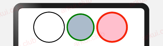
Ring并传值import {Ring} from './../common/widgets/ring_widget.ets' // 引入自定义的Ring组件 @Entry @ComponentV2 struct ComponentTest { build() { Column() { Row({space: 5}) { Ring() // 显示默认圆环 Ring({ringAttribute: { // 参数传递 radius: 40, // 设置圆环的半径 width: 8, // 设置圆环的宽度 color: Color.Green, // 设置圆环的颜色 solid: '#aabbcc' // 设置圆环的填充色 }}) Ring({ringAttribute: { // 参数传递 radius: 45, // 设置圆环的半径 width: 10, // 设置圆环的宽度 color: Color.Red, // 设置圆环的颜色 solid: Color.Pink // 设置圆环的填充色 }}) } } .padding(10) .width('100%') .height('100%') } }1
2
3
4
5
6
7
8
9
10
11
12
13
14
15
16
17
18
19
20
21
22
23
24
25
26
27
28运行结果如下图所示:
# 9.2.2:Canvas方式
Canvas 在 API 8 版本中正式提供,它提供了许多强大的绘制API,我们可以使用 arc() 方法来绘制弧线达到圆环的效果。
创建组件类
Ring@ComponentV2 export struct Ring { build() { } }1
2
3
4- @ComponentV2:表示
Ring是一个组件,当使用该修饰符时,必须实现build()方法,当组件创建或者后续有状态更新时会调用该方法,我们只需要在build()方法内返回布局即可。 - export:表示当前组件可以导出让外界调用。
- @ComponentV2:表示
实现
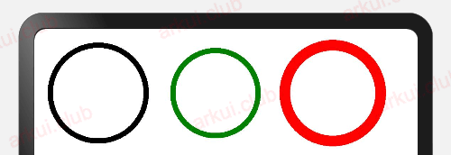
Ring组件的绘制@ComponentV2 export struct Ring { private settings: RenderingContextSettings = new RenderingContextSettings(true) private context: CanvasRenderingContext2D = new CanvasRenderingContext2D(this.settings) build() { Canvas(this.context) .width(90) .height(90) .onReady(() => { this.context.lineWidth = 3; // 设置圆环的宽度 this.context.beginPath(); // 开启路径 this.context.arc(45, 45, 45 - 3 / 2, 0, 6.28) // 绘制圆弧 this.context.stroke() // 刷新一下 }) } }1
2
3
4
5
6
7
8
9
10
11
12
13
14
15
16
17预览结果如下所示:
目前通过
Canvas绘制的方式实现Ring组件,但是这个圆环不能设置颜色和大小,因此接下来我们需要定义一下圆环的具有的属性。定义圆环属性
RingAttributeclass RingAttribute { radius: number = 45; // 圆环半径,默认45 width: number = 5; // 圆环宽度,默认5 color:Color | number | string | Resource = '#000000'; // 圆环颜色,默认黑色 solid:Color | number | string | Resource = '#ffffff'; // 填充颜色,默认白色 /** * 对非法参数进行过滤 */ public static filter(ringAttribute: RingAttribute): RingAttribute { if (null == ringAttribute || undefined == ringAttribute) { ringAttribute = new RingAttribute(); } else { var defaultAttribute: RingAttribute = new RingAttribute(); if (undefined == ringAttribute.color) { ringAttribute.color = defaultAttribute.color; } if (undefined == ringAttribute.width) { ringAttribute.width = defaultAttribute.width; } if (undefined == ringAttribute.radius) { ringAttribute.radius = defaultAttribute.radius; } if (undefined == ringAttribute.solid) { ringAttribute.solid = defaultAttribute.solid; } } return ringAttribute; } }1
2
3
4
5
6
7
8
9
10
11
12
13
14
15
16
17
18
19
20
21
22
23
24
25
26
27
28
29
30
31圆环的属性定义后又定义了一个静态方法
filter(),目的是过滤参数,如果外界没有传递对应的属性就使用默认值,接下来在Ring组件里边使用它即可。使用圆环属性
@ComponentV2 export struct Ring {

  // 准备创建Canvas组件的必要参数,固定写法
  private settings: RenderingContextSettings = new RenderingContextSettings(true)
  private context: CanvasRenderingContext2D = new CanvasRenderingContext2D(this.settings)

  // 使用圆环属性
  public ringAttribute: RingAttribute = null;

  build() {
    Canvas(this.context)
      .width(this.ringAttribute.radius * 2)
      .height(this.ringAttribute.radius * 2)
      .onReady(() => {
      	// 设置圆环颜色
        this.context.strokeStyle = this.ringAttribute.color.toString();
      	// 设置圆环填充色
        this.context.fillStyle = this.ringAttribute.solid.toString();
      	// 设置圆环宽度
        this.context.lineWidth = this.ringAttribute.width;
      	// 开始准备绘制路径
        this.context.beginPath();
      	// 通过arc方法绘制
        this.context.arc(this.ringAttribute.radius, this.ringAttribute.radius, this.ringAttribute.radius - this.ringAttribute.width / 2, 0, 6.28)
      	// 绘制圆环,不调用该方法,绘制不生效
        this.context.stroke()
      })
  }

  /**
   * 该方法在build方法执行前先执行,我们可以在这里对参数进行校验
   */
  aboutToAppear() {
    this.ringAttribute = RingAttribute.filter(this.ringAttribute);
  }
}

class RingAttribute {
  radius: number = 45;                                  // 圆环半径,默认45
  width: number  = 5;                                   // 圆环宽度,默认5
  color:Color | number | string | Resource = '#000000'; // 圆环颜色,默认黑色
  solid:Color | number | string | Resource = '#ffffff'; // 填充颜色,默认白色


  /**
   * 对非法参数进行过滤
   */
  public static filter(ringAttribute: RingAttribute): RingAttribute {
    if (null == ringAttribute || undefined == ringAttribute) {
      ringAttribute = new RingAttribute();
    } else {
      var defaultAttribute: RingAttribute = new RingAttribute();
      if (undefined == ringAttribute.color) {
        ringAttribute.color = defaultAttribute.color;
      }
      if (undefined == ringAttribute.width) {
        ringAttribute.width = defaultAttribute.width;
      }
      if (undefined == ringAttribute.radius) {
        ringAttribute.radius = defaultAttribute.radius;
      }
      if (undefined == ringAttribute.solid) {
        ringAttribute.solid = defaultAttribute.solid;
      }
    }
    console.log("radius: " + ringAttribute.radius + ", width: " + ringAttribute.width)
    return ringAttribute;
  }
}
1
2
3
4
5
6
7
8
9
10
11
12
13
14
15
16
17
18
19
20
21
22
23
24
25
26
27
28
29
30
31
32
33
34
35
36
37
38
39
40
41
42
43
44
45
46
47
48
49
50
51
52
53
54
55
56
57
58
59
60
61
62
63
64
65
66
67
68
69使用自定义组件
Ring并传值import {Ring} from './../widgets/Ring' // 引入自定义的Ring组件 @Entry @ComponentV2 struct ComponentTest { build() { Column() { Row({space: 5}) { Ring() // 显示默认圆环 Ring({ringAttribute: { // 参数传递 radius: 40, // 设置圆环的半径 width: 8, // 设置圆环的宽度 color: Color.Green, // 设置圆环的颜色 solid: '#aabbcc' // 设置圆环的填充色 }}) Ring({ringAttribute: { // 参数传递 radius: 45, // 设置圆环的半径 width: 10, // 设置圆环的宽度 color: Color.Red, // 设置圆环的颜色 solid: Color.Pink // 设置圆环的填充色 }}) } } .padding(10) .width('100%') .height('100%') } }1
2
3
4
5
6
7
8
9
10
11
12
13
14
15
16
17
18
19
20
21
22
23
24
25
26
27
28运行结果如下图所示:

# 9.2.3:MiniCanvas方式
MiniCanvas (opens new window) 是笔者基于 Canvas 组件封装的一个简化版绘图组件,它屏蔽了 Canvas 内部复杂的绘制流程,提供了精简的 API 方法,实现了使用一个API就可以绘制相关图形的能力。
安装MiniCanvas库
在MiniCanvas (opens new window) 库引入该文件。
引入MiniCanvas
import { MiniCanvas, Paint, ICanvas } from '@ohos/mini_canvas'1MiniCanvas源码已经上传到Gitee上:https://gitee.com/ark-ui/MiniCanvas (opens new window),非常欢迎读者一起完善该库。使用MiniCanvas
import { MiniCanvas, Paint, ICanvas } from '@ohos/mini_canvas'

@Entry @Component struct TestMiniCanvas {
  build() {
    Column() {
      Row({space: 5}) {
        MiniCanvas({
          attribute: {             // 设置画布基本样式
            width: 200,            // 设置画布高度
            height: 200,           // 设置画布宽度
            background: "#aabbcc", // 设置画布背景色
            antiAlias: true        // 是否抗锯齿,默认为true
          },
          onDraw: (canvas) => {    // 在onDraw方法内部开始做绘制操作
          }
        })
      }
    }
    .padding(10)
    .width('100%')
    .height('100%')
  }
}
1
2
3
4
5
6
7
8
9
10
11
12
13
14
15
16
17
18
19
20
21
22
23绘制圆环
import { MiniCanvas, Paint } from './icanvas'

@Entry @Component struct TestMiniCanvas {
  build() {
    Column() {
      Row({space: 5}) {
        MiniCanvas({
          attribute: {
            width: 200,
            height: 200,
            background: "#aabbcc",
            antiAlias: true
          },
          onDraw: (canvas) => {                    // 在onDraw()内开始绘制
            var paint = new Paint();               // 创建一支画笔
            paint.setStroke(true)                  // 设置画笔只绘制边框

            paint.setStrokeWidth(5);               // 设置边框宽度
            canvas.drawCircle(50, 50, 45, paint);  // 画圆

            paint.setColor(Color.Green.toString()) // 设置边框颜色
            canvas.drawCircle(160, 50, 40, paint); // 画圆

            paint.setColor(Color.Red.toString())   // 设置边框颜色
            paint.setStrokeWidth(10)               // 设置边框宽度
            canvas.drawCircle(270, 50, 45, paint); // 画圆
          }
        })
      }
    }
    .padding(10)
    .width('100%')
    .height('100%')
  }
}
1
2
3
4
5
6
7
8
9
10
11
12
13
14
15
16
17
18
19
20
21
22
23
24
25
26
27
28
29
30
31
32
33
34
35样例运行结果如下图所示:
# 9.2.4:小结
本节通过组合和绘制两种方式实现了圆环组件,读者已经掌握了自定义组件的流程以及给自定义组件传值的方法,另外也期待读者通过 Canvas 或者 MiniCanvas (opens new window) 实现更多精美的 OpenHarmony 组件,为 OpenHarmony 的生态发展贡献自己的一份力量。