# 3.6:公共可触摸属性
ArkUI开发框架提供的基础组件直接或者间接的继承自 CommonMethod , CommonMethod 中定义的属性样式属于公共样式,本节笔者给大家介绍一下项目种最常用的触摸类属性,读者也可自行查看 CommonMethod 的源码了解其它属性的用法。
# 3.6.1:触摸区域设置
declare class CommonMethod<T> {
  responseRegion(value: Array<Rectangle> | Rectangle): T;
}
1
2
3
2
3
给当前组件设置额外的触摸区域,当触摸点坐标落在这些区域内时,事件会派发到当前组件上,Rectangle 参数说明如下:
- x:触摸点相对于组件本身左边沿的 X 坐标,支持设置正负值百分比,当设置为 '100%' 时表示热区往右偏移组件本身宽度大小,当设置为 '-100%' 时表示热区往左偏移组件本身宽度大小。
- y:触摸点相对于组件本身左边沿的 Y 坐标。支持设置正负值百分比,当设置为 '100%' 时表示热区往下偏移组件本身高度大小,当设置为 '-100%' 时表示热区往上偏移组件本身高度大小。
- width:触摸热区范围的宽度,支持设置正值百分比,表示热区宽度设置为该组件本身的宽度。
- height:触摸热区范围的高度。支持设置正值百分比,表示热区高度设置为该组件本身的高度。
简单样例如下所示:
@Entry @Component struct Test {

  @State message: string = 'responseRegion'

  build() {
    Column({ space: 10 }) {
      Text(this.message)
        .fontSize(20)
        .size({width: 200, height: 60})
        .backgroundColor(Color.Pink)
        .onClick(() => {
          this.message = "1:" + new Date().getTime().toString();
        })

      Text(this.message)
        .fontSize(20)
        .size({width: 200, height: 60})
        .backgroundColor(Color.Pink)
        .responseRegion({ // 设置触摸区域
          x: 0,           // 起点和自身顶点一致
          y: 0,           // 起点和自身顶点一致
          width: 250,     // 设置触摸区域的宽度
          height: 100     // 设置触摸区域的高度
        })
        .onClick(() => {
          this.message = "2:" + new Date().getTime().toString();
        })
    }
    .width('100%')
    .height("100%")
    .padding(10)
  }
}
1
2
3
4
5
6
7
8
9
10
11
12
13
14
15
16
17
18
19
20
21
22
23
24
25
26
27
28
29
30
31
32
33
2
3
4
5
6
7
8
9
10
11
12
13
14
15
16
17
18
19
20
21
22
23
24
25
26
27
28
29
30
31
32
33
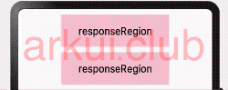
样例运行结果如下图所示:
📢:该方法适用于支持通用点击事件、通用触摸事件、通用手势处理的组件。
# 3.6.2:触摸是否可用
declare class CommonMethod<T> {
  touchable(value: boolean): T;
}
1
2
3
2
3
设置当前组件是否可以被触摸,true 表示可以触摸,false 不可以触摸,默认值为 true 。
简单样例如下所示:
@Entry @Component struct Test {

  @State message: string = 'responseRegion'

  build() {
    Column({ space: 10 }) {
      Text(this.message)
        .fontSize(20)
        .size({width: 200, height: 60})
        .backgroundColor(Color.Pink)
        .touchable(true)// 设置可以触摸
        .onClick(() => {
          this.message = "1:" + new Date().getTime().toString();
        })

      Text(this.message)
        .fontSize(20)
        .size({width: 200, height: 60})
        .backgroundColor(Color.Pink)
        .touchable(false)// 设置不可以触摸
        .onClick(() => {
          this.message = "2:" + new Date().getTime().toString();
        })
    }
    .width('100%')
    .height("100%")
    .padding(10)
  }
}
1
2
3
4
5
6
7
8
9
10
11
12
13
14
15
16
17
18
19
20
21
22
23
24
25
26
27
28
29
2
3
4
5
6
7
8
9
10
11
12
13
14
15
16
17
18
19
20
21
22
23
24
25
26
27
28
29
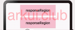
样例运行结果如下图所示:
# 3.6.3:组件禁用设置
declare class CommonMethod<T> {
  enabled(value: boolean): T;
}
1
2
3
2
3
设置当前组件是否可用,true 表示组件可用,可响应点击等操作;值为 false 时不响应点击等操作,默认值为 true 。
简单样例如下所示:
@Entry @Component struct Test {

  @State message: string = 'responseRegion'

  build() {
    Column({ space: 10 }) {
      Text(this.message)
        .fontSize(20)
        .size({width: 200, height: 60})
        .backgroundColor(Color.Pink)
        .enabled(true) // 组件可用,可以响应点击等操作
        .onClick(() => {
          this.message = "1:" + new Date().getTime().toString();
        })

      Text(this.message)
        .fontSize(20)
        .size({width: 200, height: 60})
        .backgroundColor(Color.Pink)
        .enabled(false) // 组件不可用,不可以响应点击等操作
        .onClick(() => {
          this.message = "2:" + new Date().getTime().toString();
        })
    }
    .width('100%')
    .height("100%")
    .padding(10)
  }
}
1
2
3
4
5
6
7
8
9
10
11
12
13
14
15
16
17
18
19
20
21
22
23
24
25
26
27
28
29
2
3
4
5
6
7
8
9
10
11
12
13
14
15
16
17
18
19
20
21
22
23
24
25
26
27
28
29
样例运行结果如下图所示:

请作者喝杯咖啡
©arkui.club版权所有,禁止私自转发、克隆网站。

