# 13.3:@Prop
@Prop 装饰器也是最基础的状态装饰器,它装饰的变量可以和父组件之间建立单向的同步关系,也就是说父组件把自身的状态变量传递给子组件内 @Prop 装饰的变量后,的数据源更改会覆盖到子组件内相对于 @State 来说它只能用于子组件内部,它修饰的 状态变量 不允许本地初始化,只能从父组件传递。
# 13.3.1:约束与限制
@Prop 装饰器不能用在 @Entry 装饰的组件内:
@Prop 装饰器不能用在 @Entry 装饰的组件内,否则编译报错:
The @Entry component 'XXX' cannot have the @Prop property 'XXX'.@Prop 修饰的状态变量必须初始化或者由父组件传递:
@Prop 装饰器装饰的变量要么本地进行初始化要么由父组件传递进来,否则编译报错:
The @Provide property 'XXX' must be specified a default value.@Prop 装饰符修饰的状态是单向的:
@Prop 装饰的变量可以和父组件建立单向的同步关系,当父组件内的状态数据变化时,与之关联的子组件内的 @Prop 装饰的变量都会更新,反之 @Prop 装饰的变量更改不会影响其父组件。
# 13.3.2:@Prop的简单使用
@Prop 的使用和上一章节讲述的 @State 用法类似,在变量前添加 @State 即可,需要说明的是由 @Prop 装饰的变量必须要 指定类型 和 本地初始化,如果本地未初始化则需要从父组件传递,父组件的数据可以是有状态的也可以是无状态的,简单样例如下所示:
@Entry @Component struct Page_03_prop {

  @State message: string = new Date().getTime().toString() // 父组件内定义的状态变量
  tempValue: string = "tempValue"                          // 父组件内定义的无状态变量

  build() {
    Column({space: 10}) {
      Text("time = " + this.message)
        .fontSize(30)
        .onClick(() => {
          this.message = new Date().getTime().toString()   // 更新状态变量的值
          this.tempValue = this.message                    // 更新无状态变量的值
        })

      CustomButton1()                         // 使用子组件CustomButton1,不传数据

      CustomButton1({btnName: this.message})  // 使用子组件CustomButton1,传递数据

      CustomButton2({btnName: this.message})  // 使用子组件CustomButton2,传递父组件的有状态数据
      CustomButton2({btnName: this.tempValue})// 使用子组件CustomButton2,必须父组件的无状态传递数据
    }
    .width('100%')
    .height("100%")
  }
}

@Component struct CustomButton1 {

  @Prop btnName: string = "10086" // 本地已经初始化,如果从父组件传递进来,
                                  // 那么父组件内的数据源如果是状态数据且发生了变更
                                  // 则会覆盖本地的数据,否则不会影响本地的数据。

  build() {
    Row({space: 10}) {
      Image($r("app.media.app_logo"))
        .size({width: 18, height: 18})
      Text("btn1 = " + this.btnName)
        .fontSize(22)
    }
    .padding({left: 20, right: 20, top: 5, bottom: 5})
    .backgroundColor("#aabbcc")
    .borderRadius(8)
    .onClick(() => {
      this.btnName = new Date().getTime().toString()
    })
  }
}

@Component struct CustomButton2 {

  @Prop btnName: string  // 本地已经初始化,如果从父组件传递进来,
                         // 那么父组件内的数据源如果是状态数据且发生了变更
                         // 则会覆盖本地的数据,否则不会影响本地的数据。

  build() {
    Row({space: 10}) {
      Image($r("app.media.app_logo"))
        .size({width: 18, height: 18})
      Text("btn2 = " + this.btnName)
        .fontSize(22)
    }
    .padding({left: 20, right: 20, top: 5, bottom: 5})
    .backgroundColor("#aabbcc")
    .borderRadius(8)
    .onClick(() => {
      this.btnName = new Date().getTime().toString()
    })
  }
}
2
3
4
5
6
7
8
9
10
11
12
13
14
15
16
17
18
19
20
21
22
23
24
25
26
27
28
29
30
31
32
33
34
35
36
37
38
39
40
41
42
43
44
45
46
47
48
49
50
51
52
53
54
55
56
57
58
59
60
61
62
63
64
65
66
67
68
69
样例运行结果如下图所示:
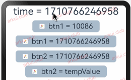
由上述样例可知,自定义子组件 CustomButton1 添加了 @Prop 装饰的状态变量 btnName 并且赋予了初始值,那么使用该自组件时父组件可以传值也可以不传值;自定义子组件 CustomButton2 也添加了 @Prop 装饰的状态变量 btnName 但该属性没有初始化,因此在使用该组件时必须由父组件传值来初始化 btnName,此时父组件传递进来的数据可以是有状态的也可以是无状态的,如果是有状态的,那么父组件的状态数据若发生变化则会同步到子组件里,反之子组件的状态数据发生变化则不影响父组件。
# 13.3.3:@Prop的作用域
@Prop 装饰器装饰的变量是当前组件私有的,只能在当前组件范围内访问,简单样例如下所示:
@Entry @Component struct Page_03_prop {

  @State message: string = new Date().getTime().toString()

  build() {
    Column({space: 10}) {
      Text("time = " + this.message)
        .fontSize(30)
        .onClick(() => {
          this.message = new Date().getTime().toString()
        })

      CustomButton({btnName: this.message})
    }
    .width('100%')
    .height("100%")
  }
}

@Component struct CustomButton {

  @Prop btnName: string = "10086"

  build() {
    Row({space: 10}) {
      Image($r("app.media.app_logo"))
        .size({width: 18, height: 18})
      Text("btn1 = " + this.btnName)
        .fontSize(22)
    }
    .padding({left: 20, right: 20, top: 5, bottom: 5})
    .backgroundColor("#aabbcc")
    .borderRadius(8)
    .onClick(() => {
      this.btnName = new Date().getTime().toString()
    })
  }
}
2
3
4
5
6
7
8
9
10
11
12
13
14
15
16
17
18
19
20
21
22
23
24
25
26
27
28
29
30
31
32
33
34
35
36
37
38
样例运行结果如下图所示:
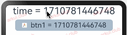
由上述样例可知:父组件 Page_03_prop 和子组件 CustomButton 内部都定义了状态数据状态数据 message 和 btnName,在使用的时候父组件传递了自己的状态数据给子组件,因此父子组件的状态数据 message 和 btnName 就建立了单向的关联关系,一旦 message 的值变化就会同步更新到 btnName,反之 btnName 的值变化不会影响到 message。
# 13.3.4:@Prop支持的数据类型
@Prop 装饰器目前支持的数据类型主要如下:
简单数据类型
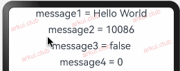
简单数据类型目前支持的类型有: number, boolean, string, enum。简单样例如下所示:
enum ColorType {
  R,
  G,
  B
}

@Entry @Component struct Page_03_prop {

  @State message1: string  = 'Hello World' // 定义 string  类型
  @State message2: number  = 10086         // 定义 number  类型
  @State message3: boolean = false         // 定义 boolean 类型
  @State message4: ColorType = ColorType.R // 定义  enum   类型

  build() {
    Column({space: 10}) {
      CustomButton({
        message1: this.message1,
        message2: this.message2,
        message3: this.message3,
        message4: this.message4,
      })
    }
    .width('100%')
    .height("100%")
  }
}

@Component struct CustomButton {

  @State message1: string  = 'Hello aaaaa' // 定义 string  类型
  @State message2: number  = 1234          // 定义 number  类型
  @State message3: boolean = false         // 定义 boolean 类型
  @State message4: ColorType = ColorType.G // 定义  enum   类型

  build() {
    Column({space: 10}) {
      Text("message1 = " + this.message1)
        .fontSize(22)
        .onClick(() => {
          this.message1 = "Hello《ArkUI实战》";
        })
      Text("message2 = " + this.message2)
        .fontSize(22)
        .onClick(() => {
          this.message2 = 10010;
        })
      Text("message3 = " + this.message3)
        .fontSize(22)
        .onClick(() => {
          this.message3 = true;
        })
      Text("message4 = " + this.message4)
        .fontSize(22)
        .onClick(() => {
          this.message4 = ColorType.B
        })
    }
  }
}
1
2
3
4
5
6
7
8
9
10
11
12
13
14
15
16
17
18
19
20
21
22
23
24
25
26
27
28
29
30
31
32
33
34
35
36
37
38
39
40
41
42
43
44
45
46
47
48
49
50
51
52
53
54
55
56
57
58
59样例运行结果如下图所示:
简单数组类型
简单数据类型 目前支持的有: number, boolean, string, enum,笔者把由它们组成的 数组 简称为简单数组,目前简单数组支持的操作为:数组重新赋值,数组单项赋值,数组数据添加 和 数组数据删除,以上支持的操作会引起相关组件的重绘。简单样例如下所示: